![]()
Did you know that it is actually someone’s job to sit down and name the colour of the year every year?
What a great gig, right?
When I first heard that “colour of the year” was a real thing I had a lot of questions.
Who decides?
How do I know what the colour of the year is?
What difference does it make to me?
I’m not Mr Fashion Conscious. I’m not some kind of designer or artist that has to keep up with every trend.
Of what importance is such a trivial thing like “colour of the year”?
As it turns out, the colour of the year literally touches us every day.
From the clothes we wear to the cars we drive to the paint on the walls of our homes. The colour palette that pleases our senses is ultimately decided by a person or persons we will never meet.
Whose job is it?
While there are lesser companies pretending to be the authority, one company dominates the color trend business – Pantone. Pantone Inc. is a corporation headquartered in Carlstadt, New Jersey.
The company is best known for its Pantone Matching System (PMS), a proprietary colour space used in a variety of industries, primarily printing, though sometimes in the manufacture of coloured paint, fabric, and plastics.
To be more specific, The Pantone Color Institute decides the colour of the year.
This a consulting service within Pantone that forecasts global colour trends and advises companies on colour in brand identity and product development, for the application and integration of colour as a strategic asset.
Pantone is recognised around the world as a leading source of colour information through seasonal trend forecasts, custom colour development, and palette recommendations for product and corporate identity,
Pantone Color Institute partners with global brands to leverage the power, psychology and emotion of colour in their design strategy. And you thought the big box of 64 crayons was complicated.
If you want to know what the colour of the year is, you don’t need me to tell you.
Watch major news networks and see what color lead anchormen’s ties are.
Watch The Academy Awards, The Golden Globes or the BAFTA’s and see the predominant colour of leading ladies’ fancy dresses. Drive to a new car lot and see which colour sticks out from the ubiquitous black, white and grey.
Pick up a brochure from a paint store and witness an entire season of new colours swirling around one main colour. The Colour of the Year is a real thing and, like it or not, you’re involved.
And the winner is …
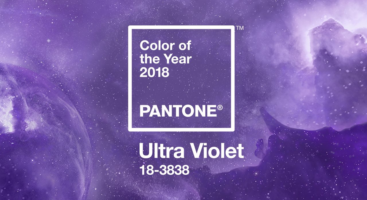
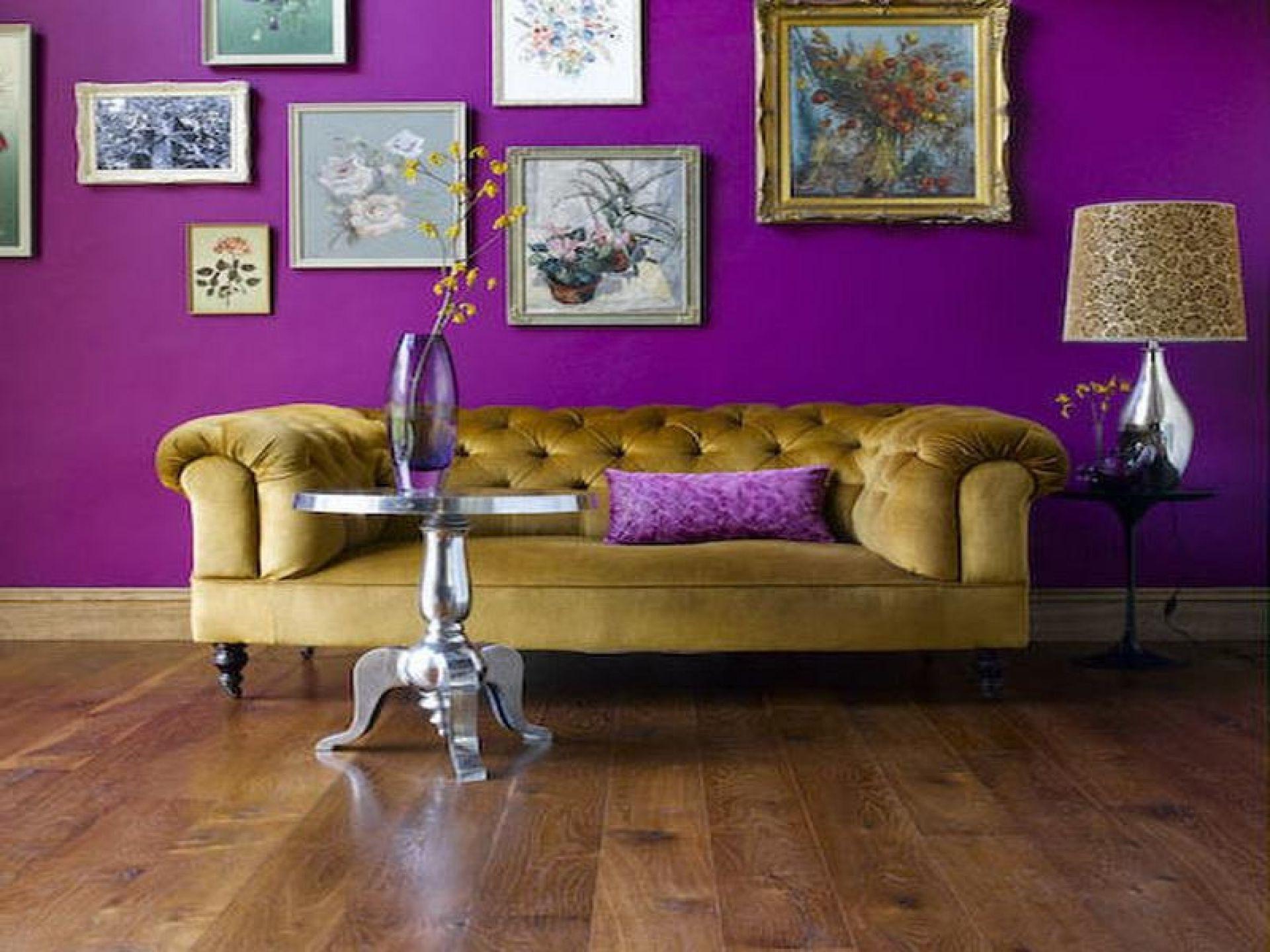
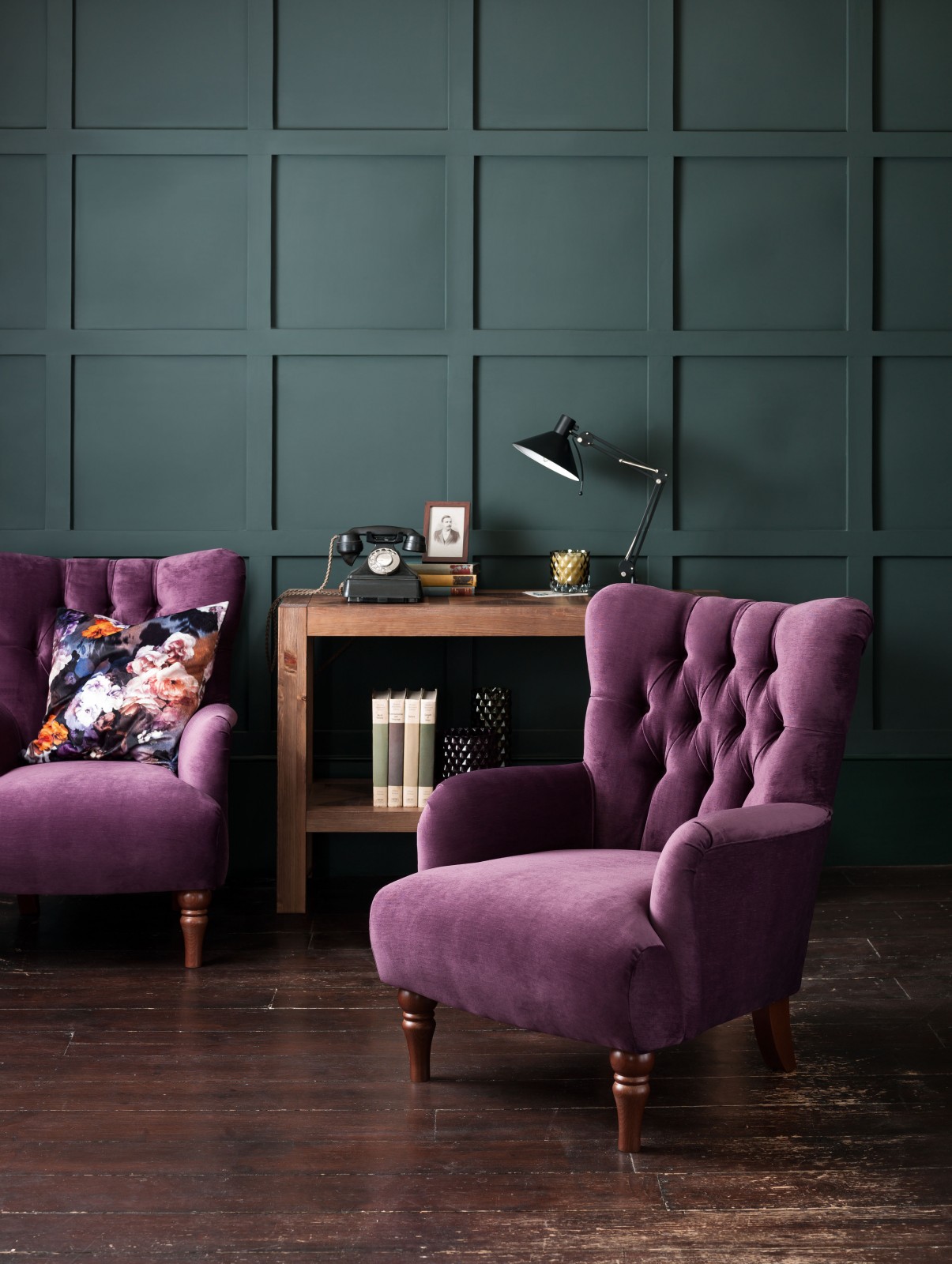
This year, the COTY just happens to be one of my favourites: Ultra Violet.
Purple is a color that is easy to love and hard to pull off by the common man.
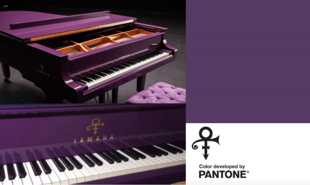
Pantone 18-3838, Ultra Violet is the 2018 Colour of the Year.
According to Leatrice Eiseman (executive director of the Pantone Color Institute), “Ultra Violet is a blue-based purple that takes our awareness and potential to a higher level. From exploring new technologies and the greater galaxy, artistic expression and spiritual reflection, intuitive Ultra Violet lights the way to what is yet to come”.
Wow!
That’s what I call “colourful language”.
I don’t know about all this cosmic blather, but to be sure purple is an enigmatic and inspiring colour.
One reason I embrace purple is that it has long been symbolic of counterculture, unconventionality and artistic brilliance.
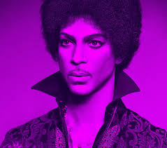
Musical icons like Prince, David Bowie and Jimi Hendrix brought shades of Ultra Violet to the forefront of western pop culture as personal expressions of individuality.
People who push boundaries use purple and there’s something attractive about that.
Additionally, mythical and spiritual qualities have always been attached to Ultra Violet.
This colour is often associated with mindfulness practices which offer refuge from our over-stimulated world. Many a meditation space is lit with purple lighting to energise souls, bringing their minds and bodies into balance.
Make it work for you
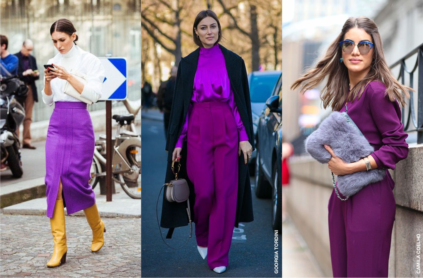
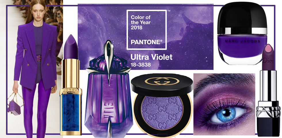
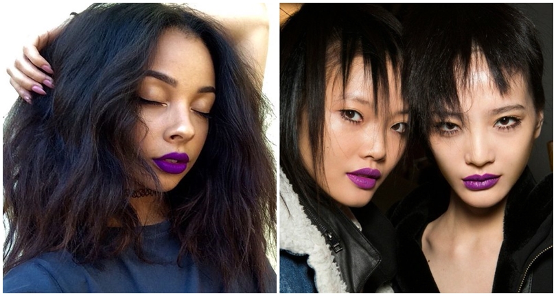
You’re going to see this colour all around you this year.
From women’s lipstick and eyeshadow to retail packaging to throw rugs.
Embrace it and figure out how to make it work for you.
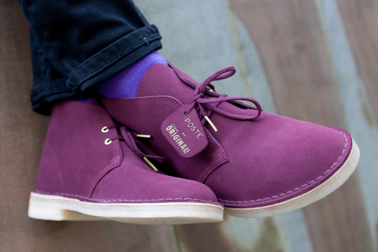
Ultra Violet is gender neutral and oblivious to season, slipping a few pieces of purple clothing into your fashion lineup could make you look uber-trendy and might even energise your mood a bit.
Ultra Violet is a combination of red and blue and thus easy to pair without fear of clash.
This colour transcends material as well. A purple velvet blazer is posh and bold at the same time. A pair of purple high-top sneakers are as cool as it gets. Don’t underestimate the power of purple.
Where we are mostly likely to use our new found knowledge of the Colour of the Year is in our home décor.
This particular coluor can be used to express boldness on an accent wall or to add sophistication when paired with moderate grays and greens. If you visit Pantone’s website you can see eight different “palette stories” with Ultra Violet as a versatile trans-seasonal and gender-neutral anchor in every palette.
Each of the eight palettes conveys its own distinctive feeling and mood and can easily cross-over fashion and accessories, beauty, home interiors, and graphic design applications.
If you are looking for a group of colours to paint your new condo or house, you can give the exact PMS colour codes to the paint shop and get it perfect every time.
My favourite technique when creating a palette of colour for a new house is to blatantly cheat. I go to a nice interior design shop that is guaranteed to be on the cutting edge like Jim Thompson, Pasaya, etc.
Then I find a piece of fabric that has a combination of colours I like. Sometimes it’s a lounge pillow, other times a bedspread.
Then I buy the piece and match colours to their colours accordingly I don’t need to be a designer, someone else has done all that work.
That’s all it really takes to be slightly hip. Put the Pantone website in your bookmarks folder, check it once a year and apply the new colour as you see fit.
By Bart Walters